What do you need to make a truly stand out and successful game trailer? Derek Lieu put together a list of things you should prioritize in order to make that happen (top being most important, bottom being the least).
Fortunately, most of the list is completely achievable for beginner trailer editors. Don’t worry about things further down the list until you’ve tackled things at the top. If top of the list things are out of your control, then just move on down and do the best you can:
- Game Art
- Music
- Sequence of ideas
- Visual clarity
- Gameplay clarity
- Narrative clarity
- Features & content
- Trailer length
- Edit, Audio, Graphics polish
Game Art
Realtalk: the art design and direction of a game will do more to garner interest in a game than almost anything even the best trailer editors can do with their bag of tricks. If a game doesn’t have a striking art style, it will be far less likely to draw attention. It’s SO much easier to draw attention with good art, it almost feels like cheating.
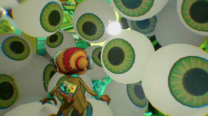
Look at games like: Untitled Goose Game, SUPERHOT, Ape Out, Manifold Garden, Psychonauts 2, Firewatch, Inscryption, Unpacking, Neo Cab, Castle Crashers, Hades, Ooblets, Ori and the Blind Forest, Exo: One, and The Long Dark. These games all have distinctive art styles which command attention before you even see them in motion.
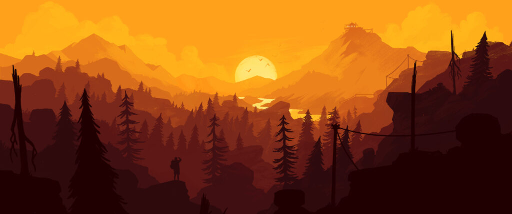
I can’t very well say to everyone: “Just hire an AMAZING art director” but game art at every level is worth investing in. If your game’s art doesn’t make it stand out from a crowd, you’ll have to make everything else that much better to make a stand out trailer.
Music
Good music makes or breaks a trailer like few things can. It’s why people love trailers like the Grand Theft Auto “Welcome to the Jungle” trailer, or the Gears of War “Mad World” trailer. But it doesn’t have to be nostalgic and expensive licensed music to make a trailer. There are plenty of talented game composers and trailer music companies who make music which really sets the tone and immerses you in the world. And most in-game music designed to loop endlessly isn’t good for trailers.
This is the first thing on the list which you might have a degree of control over when making a trailer. Either because you can use the game’s composer to make a custom track for the trailer, or because you don’t yet have a composer so you can license music which feels tonally appropriate and has good trailer structure. You want to be working with good trailer music which has a beginning, middle, and end. Not gameplay music which loops forever and sounds exactly the same through and through. It’ll make the trailer that much more fun to watch, and it’ll make your job easier, especially if you’re not a very experienced trailer editor.
Sequence of Ideas
The next most important thing is where we start getting into the high level overview of the trailer’s editing and that is the sequence you present ideas. The most basic I recommend is (in this order): Genre, Hook, Content, but another useful way to think about it is in terms of the questions the audience needs answered.
To sum up, people first need to know what genre the game is, then what its unique hook or twist on the genre is, and if there’s time you can explore its features, the quantities of content, the modes, etc. If you talk about HOW MUCH game there is before people even know they want it, they won’t care. You can’t expect to sell ice cream flavors until people have had a taste of what makes your ice cream unique.
Visual Clarity
Footage from games can easily look very overwhelming and confusing due to the density of objects on screen, HUD/UI elements, dialogue bubbles, numbers, meters, and so much more information which is on screen for the player’s benefit. If your game capture is too confusing, too cluttered, or too overwhelming, then you seriously risk losing the audience’s attention. Or at the very least they might stop retaining the information you’re throwing at them. If people can’t tell what they’re looking at, then everything else falls apart. They might disengage from the trailer and stop watching, or just leave feeling very confused.
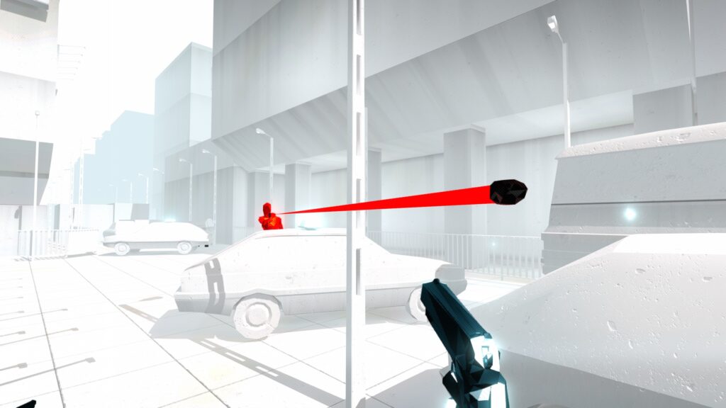
I often see game trailers which feel to me like they’re a giant hose of information being sprayed towards a sponge stuck to a wall. Yes, technically all the information about your game is being thrown at the player, but how much of it is actually soaking in? Visual clarity helps hone that stream so it has a better chance of being absorbed. This basically means ensuring each shot is easy to understand because you carefully considered and chose what to show (and what not to show) to reduce cognitive load. Or maybe you went the extra mile and made the eye trace very smooth.
Gameplay clarity
For this I specifically mean people need to understand how the game works. It can be very frustrating if people don’t understand how the game works and/or how they control it. The interactivity of games is what differentiates them from other forms of storytelling. So, if people don’t know what the game is like, they’re less likely to want to play it. This is why I push against excessive slow camera moves through environments to start a game trailer.
It’s really important for people to see shots where things happen because the player initiated them. Even if it’s something as simple as the player approaching an NPC and a word bubble popping up. For example, if the shot starts when the bubble is already there, we don’t know if it’s a cutscene or if the player chose to speak to that person. If the game teaches a mechanic through a short tutorial, it might be necessary to quickly go through all those steps in the trailer too.
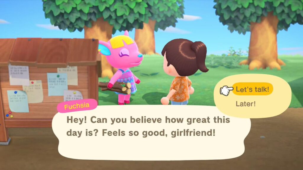
Since so many games mix things up, players still need a baseline of knowledge even when watching a trailer in a familiar genre. You facilitate gameplay clarity with well captured footage where it’s clearly understandable who or what the player is controlling. Depending on the game it could be as simple as showing the in-game camera angle since there are many genres which are almost defined by the camera perspective.
Narrative Clarity
As much as I love stories in games, they’re often not the most important thing to communicate in a trailer, which is why I put this last for these topics about clarity. The truth is, as long as the game is fun, a lot of people will probably still enjoy the game even if the story doesn’t connect with them. Several game trailers do just fine with communicating the bare minimum of story, or putting in a few disconnected snippets which vaguely give a sense of the story.
Telling a story in a trailer which consists of just a handful of lines of dialogue from a large game is very difficult. The benefits of having a really tightly edited story in the game trailer is not quite as important as the gameplay and visuals being very clear. Don’t get me wrong, if you can have all of it in one trailer then it can turn out awesome and give a really full sense of the game.
Features and Content
Features and Content refer to those bullet points you often see in trailers like: 60 levels! 10 boss battles! 20 weapons! New Game Plus! Alternate Game modes! Again, these can’t interest people until they understand and are interested in the core design. This is stuff people can read about later on the store page after the trailer has done a good job showcasing the game’s experience in the trailer. People don’t want to come back to the ice cream shop for more unless they like their first taste. Don’t sell the quantity, when the thing itself is still unknown.
Trailer Length
Unless your trailer is going to be featured in some sort of showcase, there typically isn’t a restriction on how long it should be. Don’t worry about this too much unless it’s starting to go above 90 seconds, which is a typical game trailer length. Of course, shorter is always better, but I’d rather the trailer be a bit longer if it meant everything else about it was clearer.
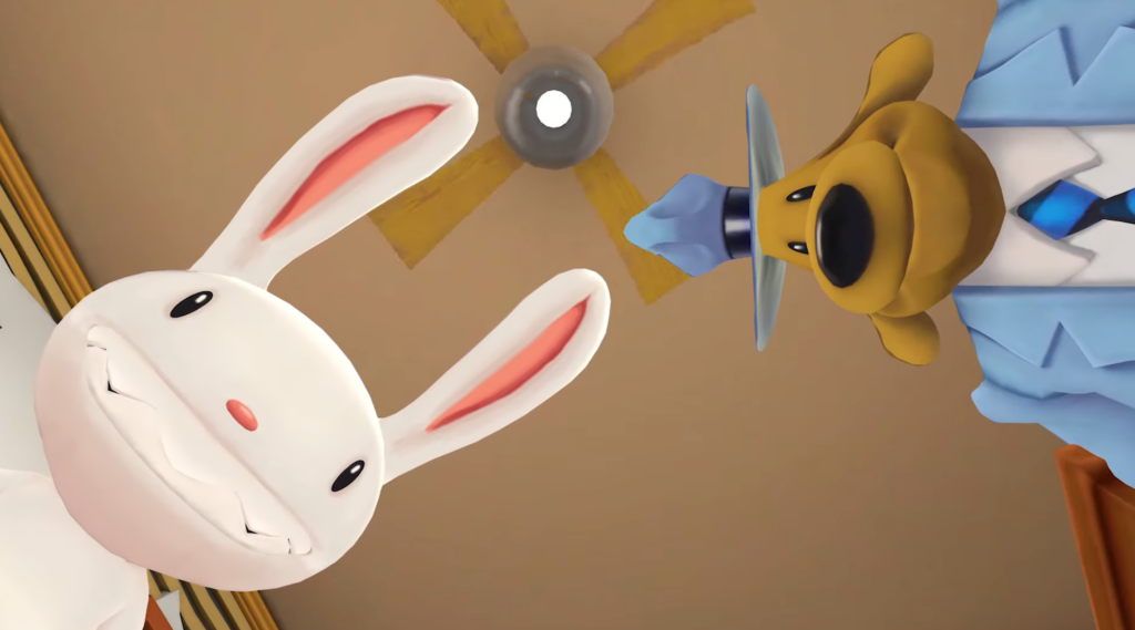
Editing, Audio and Graphics Polish
Of course good editing can be transformative for game trailers, and it can be what facilitates clarity of gameplay, story, and visuals. But what I’m talking about are trailer editing flourishes like flutter cuts, music stop downs, motion graphics, and other things that make a trailer look very shiny. I’d rather you make a trailer which has far less flashy editing which has all the other priorities, than one which is all style but no substance.
Even though I’m an editor, I put this dead last because I know not everyone has the experience, time, or desire to be a professional trailer editor. And everything above this is where I think most people miss the mark. Without everything at the top of this list, editing flash and flair can just make it look like the trailer is trying to overcompensate for weak source material.
So there you have it! Those are the parts of a game trailer I think it’s best to prioritize in the order you should consider them. Start at the top and work your way down to the best of your ability and/or the abilities of the people helping make the trailer. But don’t sacrifice things at the top of the list for the sake of things below.
As best you can, try to lock down these aspects of the trailer before moving onto the next and you’ll be on your way to making a more successful and stand out game trailer!
- Game Art – Is it eye catching?
- Music – Is it pretty to the ears?
- Sequence of ideas – Genre, Hook, Escalation, Climax
- Gameplay clarity – Can I understand how it plays?
- Visual clarity – Can I see what is happening?
- Narrative clarity – Does the story make sense?
- Features & content – How much content is there?
- Trailer length – Is it long/short enough?
- Edit, Audio, Graphics polish – Last 10% which makes it satisfying to watch
Derek Lieu is a master at making game trailers. If you are interested in creating your own game trailers, you might want to consider taking his course. Check here for more details.

